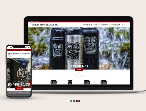
The Value of Great Homepage Design You never get a second chance to make a first impression. That’s why your homepage is undoubtedly one of — if not the most — important pages on your website. If your homepage fails to immediately connect with visitors, or those visitors don’t know what to do once they arrive on your homepage, their knee-jerk reaction will be to bounce (i.e., navigate away from your site). From an analytics standpoint, a high bounce rate on your homepage is an indicator that something’s wrong, and that it may be time to rethink your homepage’s design. But before you dive into the nitty-gritty of managing a redesign, take the time to research what other companies in your industry — and beyond your industry — are doing. We’ve collected 50 examples of brilliant homepage design that you can draw inspiration from. Keep in mind that screenshots alone don’t always do these homepages justice, so feel free visit them (links are provided) so you can get the full experience. Two terms you’ll hear along the way: 1) “Parallax scrolling” or “parallax design.” It’s when background elements move at different speeds than foreground elements as you scroll down a page, creating a sense of depth. 2) “Hover state.” It’s when a button or other clickable element changes in appearance or behavior when you hover over it with your cursor. Alright, we’ve got all our bases covered. Enough with this “reading” nonsense: let’s look at some brilliant homepage designs.


